
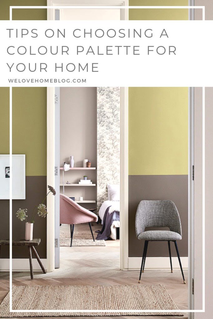
Tips and tricks on how to choose a harmonious colour pallet for your home. Come join my Part Two of my ‘Interior Styling For Beginners’ course. In this section, we are going to learn how to choose the perfect interior colour scheme for every room in your home.
Welcome to part two of my ‘Interior Styling For Beginner’s’ course. We have already chatted about how to create a mood board in this post HERE. Today, we are going to talk about colour for your home!
If you are new to this course, and want to start at the beginning for this course please click HERE.
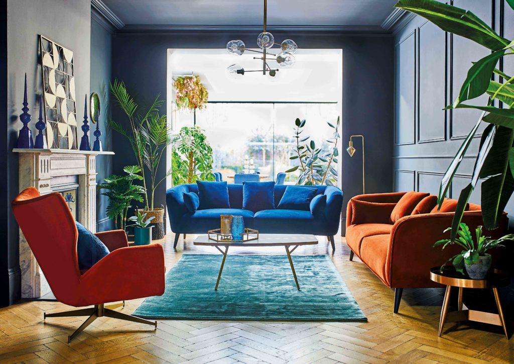
Image | Barker & Stonehouse
What is the perfect interior colour scheme?
Colour is one of the purist ways we express our emotions and feelings, it can be truly captivating. But creating a colour pallet that is perfect for your home can take time and consideration. Our cravings for different colours can change, depending on what is going on in our busy lives.
As a professional interior stylist, part of my day job is to come up with lots of colours schemes for interior magazine shoots. I know that choosing a colour pallet that works with our lives, reflects our home style and works with the natural light can be tricky to get just right.
That’s why I’m sharing my easy tips on how to create an interior colour scheme that you will be happy with for years.
Calming power of colour in your home
Colour has a huge impact on our moods and well being. Think of colour in our homes in the same way we use nutrients for our bodies. Colour has the ability revive, excite and energise us.
We make decision depending on what is going on in our busy lives, our health, or even our stress levels – and we are going to be drawn to the colours that re going to bring us balance. The colours that we want around us all the time are going to be the most healing and supportive for us. And these are the colours we should be looking to decorate our homes in.
Have you ever walked into a room and instantly felt uncomfortable as the walls were too dark? Or visited a space and found the white walls clinical? Colour instantly changes the mood of a home. The bolder the colour choices therefore the more dramatic the transformation.
Blush Tones
Pick colours for your home that inspire you. Don’t feel that certain paint colours can only be used in particular rooms. For example in the images below show that shades of pink can work every room setting.
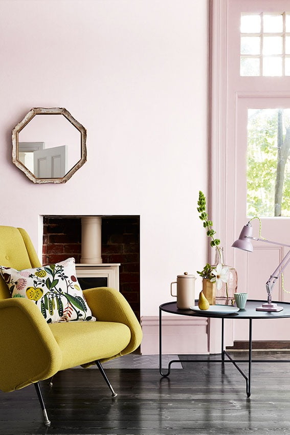
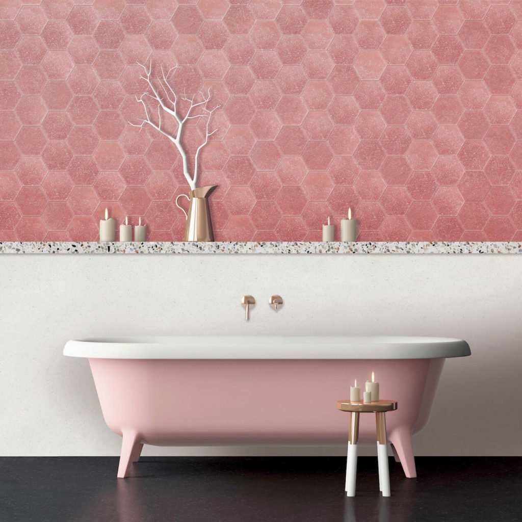
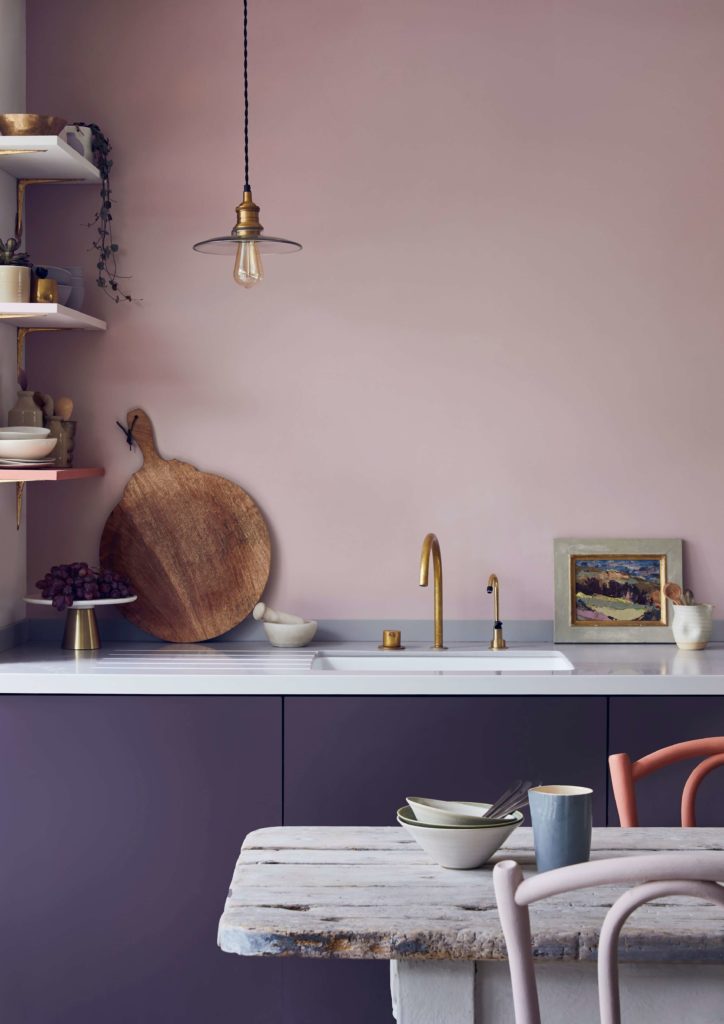
Images |Top: Annie Sloan Left: Little Greene Paint Company Right: Otto Tiles
Using Pinterest to narrow down your colour choices
Pinterest is an amazing resource for looking at colours for our home.
On my own Pinterest account, I have whole boards dedicated to just one colour – like lemon yellow, dark navy or blush pinks. And in each board there are 100s of ideas of how to this single colour in a room.
Take a look at your Pinterest boards – what colours keep cropping up? Is there a common theme? Start to narrow down what instantly appeals to you by creating a board that is purely focused on colours that make you feel instantly happy. Is your board full of rainbow shades? Or calm, and collected with white walls and pale woods.
Blue Hues
Blue is the perfect shade for any property. Mix with green for a tropical look. Rich navy tones are perfect with oranges. While blue and mustard feel fresh and modern.
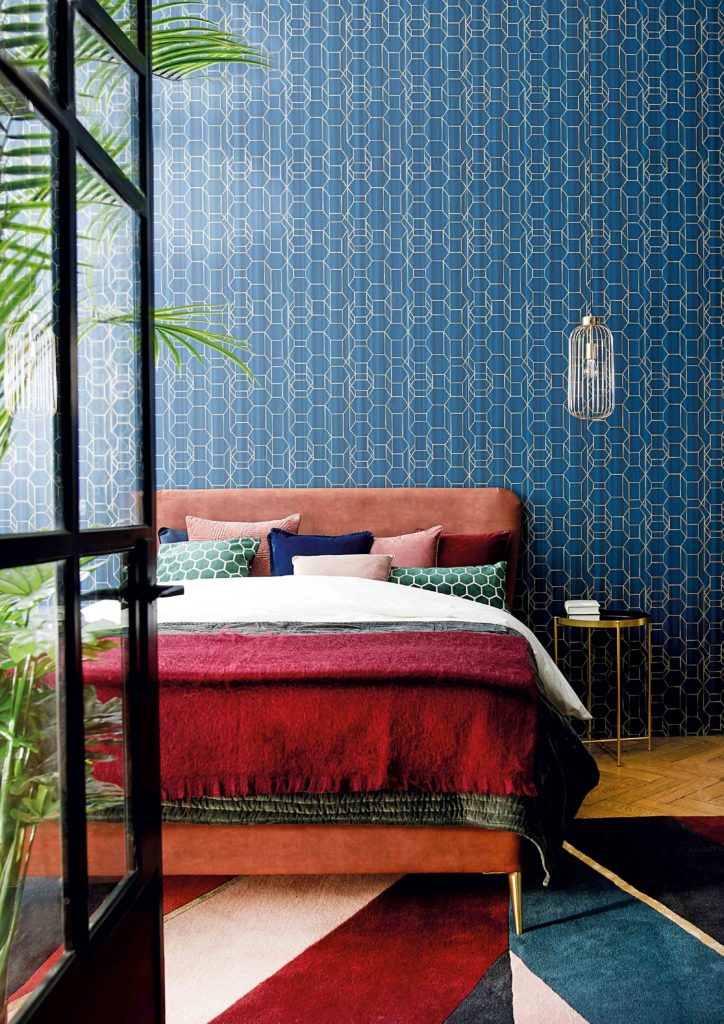
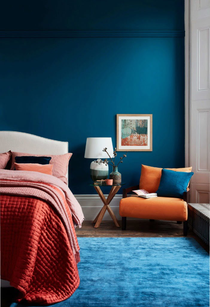
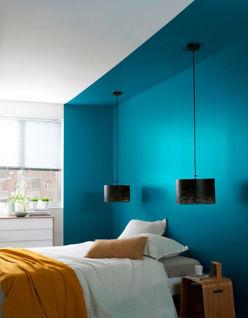
Image: Top: Barker & Stonehouse Left: Farrow & Ball Right: GoodHome Paint
How to start picking colours
There are lots of theories surround colour choices, and the physical impact they can have on your home. Colour is not about capturing the latest trend, it is more about how it makes you feel.
Holiday shades are the best way to bring colourful joy to your home. Do you want your home to capture the joy from a camping trip to Cornwall? Or have the warmth of a burnt corn field you remember from childhood summers spent in Spain? Or the playfulness of brightly painted houses spotted in San Francisco from a road trip in your 20s.
Colour is so much more than just a paint chart. It’s about how you want your home to feel. One way to refine your colour pallet can be as simple as looking at the things you already own and love.
Before you start picking paint colours, you need to ask yourself the following questions:
Where did I last feel a sense of contentment?
How do I want my home to feel from room to room?
What do I want my home to reflect about my life?
Jot down your answers. A flash of colour can instantly bring back a long-lost memory, it can lift our mood, it can energise and calm us all at the same time.
For most of us, these answers will be about family, socialising, relaxing, feeling calming – and when we think back, what colours we want to bring out from these memories. you have decided to apply your chosen colour palettes to the entire house,
Creating your own colour pallet can be as easy as walking around your home and noticing items that that you love and adore. Items that bring your pleasure.
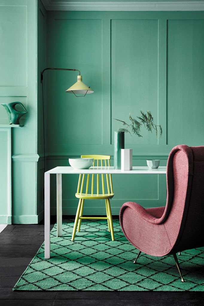
Chic Teals
Colour comes in many depths and layers. In the images below, the colour teal gives each room a distinctively different look depending on the intensity of the colour
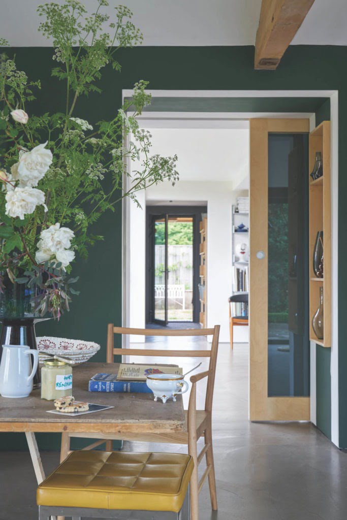
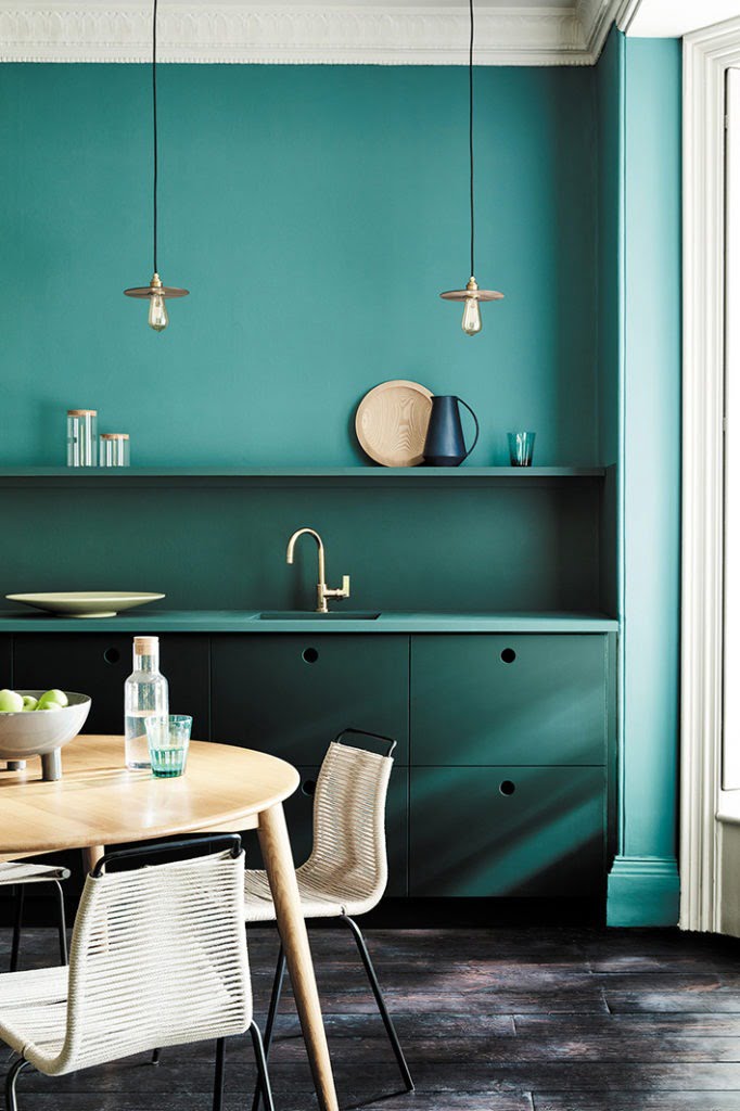
Images | Top: Little Greene Paint Company Right and Left: Farrow & Ball.
It can be the pattern on a cushion, a holiday postcard, the fabric of a vintage dress, flowers in your garden. I find it helpful to look at my wardrobe and see what colours I like to wear as this can be an indicator of what shades inspire me.
You’ll notice a common thread of colours. Like a magpie, gather these items to you and you will notice an emerging colour pallet.
Wouldn’t it be wonderful to bring these tones to your walls to reflect and enhance the things you already own and love?
And remember, we are all different. What colours, I love – you may hate. This is very much a personal thing. If you find dark colours repressive, then avoid them. Just because interior trends tell us bright colours are in fashion right now, they may not be right for us and our homes.
If you find picking colours for your walls overwhelming, then call in the professionals. Lots of paint companies offer a colour consultation service to help you pick paint colours that will work in your home like Farrow & Ball or Little Greene Paint Company. Dulux have an online service HERE while Crown paints have an app you can download to your phone. Use these services to help you pick the perfect colour pallet for your home.
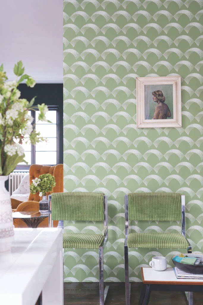
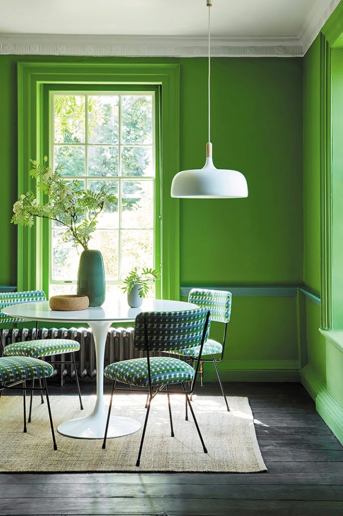
Calming Greens
Greens are very creative colours to add to your rooms. Try adding patterns, pops of colours or quirky accessories to own the look.
Do you feel confident to choose the perfect interior colour scheme for your home?
I hope this post has helped you look at colour in a different ways. Rather than picking directly off a paint chart, think about what colour does to your head and heart. Start by asking yourself what colours do I like, how do I want my home to make me feel, and look around your home for colour inspo.
I bet you’ll be surprised by the end result! I imagine their will be colours on there that you ever imagined for your home.
If you are looking to decorate your home from scratch then one way to hone down your paint and wallpaper choices is with a mood board. I talk about how to create one in this posts HERE.
Time to pick your colours…
I hope this post has given you tips on where to start. I’d love to know what you think! Please put your tips and comments in the box below. Let me know, what room you love the most from the images pictured.
You May Also Like
Join My Free Interior Styling Course
Part Two: Choosing The Perfect Colour Pallet
The New Neutrals Trend For 2019
My current home (still renovating after two years there) has evolved as mainly soft white walls and all rooms are a combination of natural materials such as wood, greenery and slate with soft combinations of sage green, soft mid greys, blush and duck egg. A few rooms are have coloured walls (lounge, duck egg, bathroom, soft grey and bedroom soon to be a soft mid-teal/grey) but as a whole they all flow together nicely.
What is interesting is that my new house was built in the 1970s and a lot of the style of furniture and accessories from my old house (built around 1900) just don’t fit. I have been phasing them out for something more retro to fit in with my new home.
I agree – I think it is important to style your home in the keeping of the era when it was built. So for a 1970s building, the furniture will proportionally fit the size of the rooms. But colourwise, I think you can be more flexible.
I would be more daring but have to consider the OH also – getting him round to the idea of grey walls was a challenge! I do have a lot of artwork and a few gallery wall installations which bring colour and detail to the walls. Pattern also introduced through cushions and blinds The utility and downstairs cloakroom are next on the reno list – I have plans for a complete change in colour – a deep teal/navy with industrial accessories such as lighting etc.
That is why mood boards are brilliant. They show your OH what the final look will be which will convince them to be a little bit braver 🙂 Your room sounds lovely!